Digitail - Case Study
Digitail
Case Study
Digitail - Case Study
20.4%
Book a Demo Conversion
$20K
Spend saved vs other agency
100%
Stakeholder Satisfaction
20.4%
Book a Demo Conversion
$20K
Spend saved vs other agency
100%
Stakeholder Satisfaction
See the case study

The Challenge
The Solution
Enterprise clients didn't see them as a serious competitor. The previous brand/website experience relied heavily on generic statements lacking concrete examples and substantive proof.
The Challenge
The Solution
Enterprise clients didn't see them as a serious competitor. The previous brand/website experience relied heavily on generic statements lacking concrete examples and substantive proof.
Outcome



"The website has been getting A LOT of compliments. Internal team members, prospects, customers, our investors...they're all impressed with it."
"The website has been getting A LOT of compliments. Internal team members, prospects, customers, our investors...they're all impressed with it."

Mike Rodgers
Head of Marketing, Digitail
About The Project
Redesigning a Platform to Prove Its Own Value
Digitail is veterinary practice software. Used by clinics, hospitals, and shelters to run scheduling, communication, payments, and more.
But here's the problem we found. The site telling that story wasn't backing it up.
Pages leaned on vague promises. "Nurture relationships." "Increase compliance." No names, no numbers, nothing a skeptical reader could check. The navigation described features instead of making a case for them. And the visual design read as playful, not credible. That's a real issue when your buyer is an enterprise decision maker sizing up vendors.
So we rebuilt the site around one principle. Every claim needs evidence.
Real clinics replaced anonymous testimonials. Specific numbers replaced adjectives. Press mentions, client logos, and review counts got woven through the entire journey, not stacked at the top and forgotten. We restructured the navigation to guide skeptical visitors toward a decision instead of just listing what exists. We rebuilt pricing so different types of buyers could actually find where they fit.
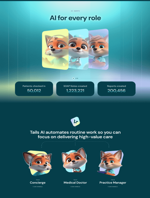
The brand's warmth stayed intact. The fox mascot, the color, the personality, all still there. But now it's paired with the structure and credibility an enterprise buyer expects. Still feels like Digitail. Now it reads as serious enough to trust.
Digitail is veterinary practice software. Used by clinics, hospitals, and shelters to run scheduling, communication, payments, and more.
But here's the problem we found. The site telling that story wasn't backing it up.
Pages leaned on vague promises. "Nurture relationships." "Increase compliance." No names, no numbers, nothing a skeptical reader could check. The navigation described features instead of making a case for them. And the visual design read as playful, not credible. That's a real issue when your buyer is an enterprise decision maker sizing up vendors.
So we rebuilt the site around one principle. Every claim needs evidence.
Real clinics replaced anonymous testimonials. Specific numbers replaced adjectives. Press mentions, client logos, and review counts got woven through the entire journey, not stacked at the top and forgotten. We restructured the navigation to guide skeptical visitors toward a decision instead of just listing what exists. We rebuilt pricing so different types of buyers could actually find where they fit.
The brand's warmth stayed intact. The fox mascot, the color, the personality, all still there. But now it's paired with the structure and credibility an enterprise buyer expects. Still feels like Digitail. Now it reads as serious enough to trust.



Drag to see
before vs after
Drag to see
before vs after
Notes
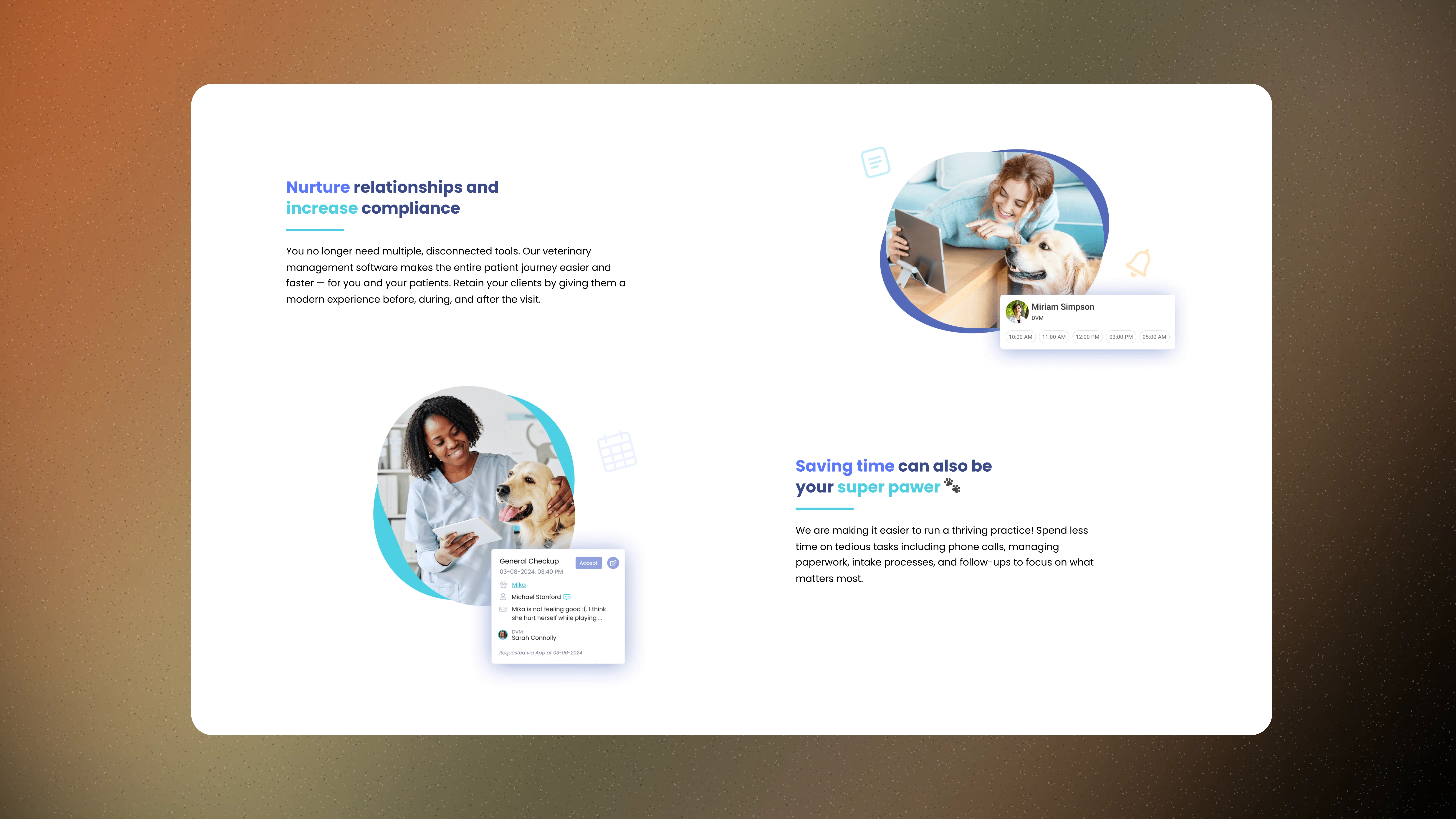
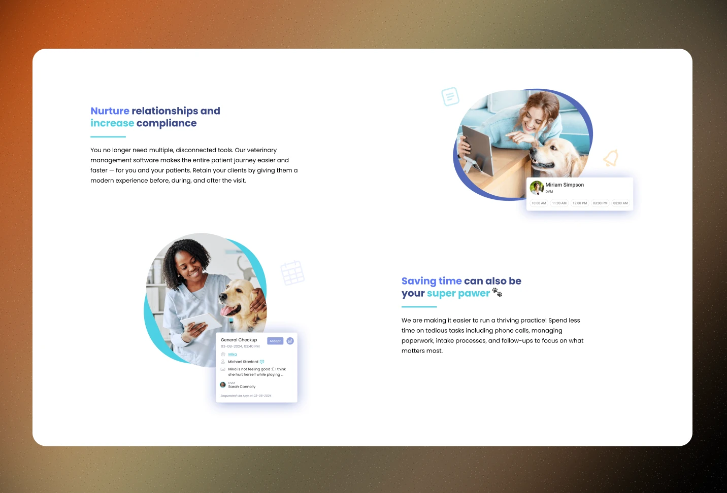
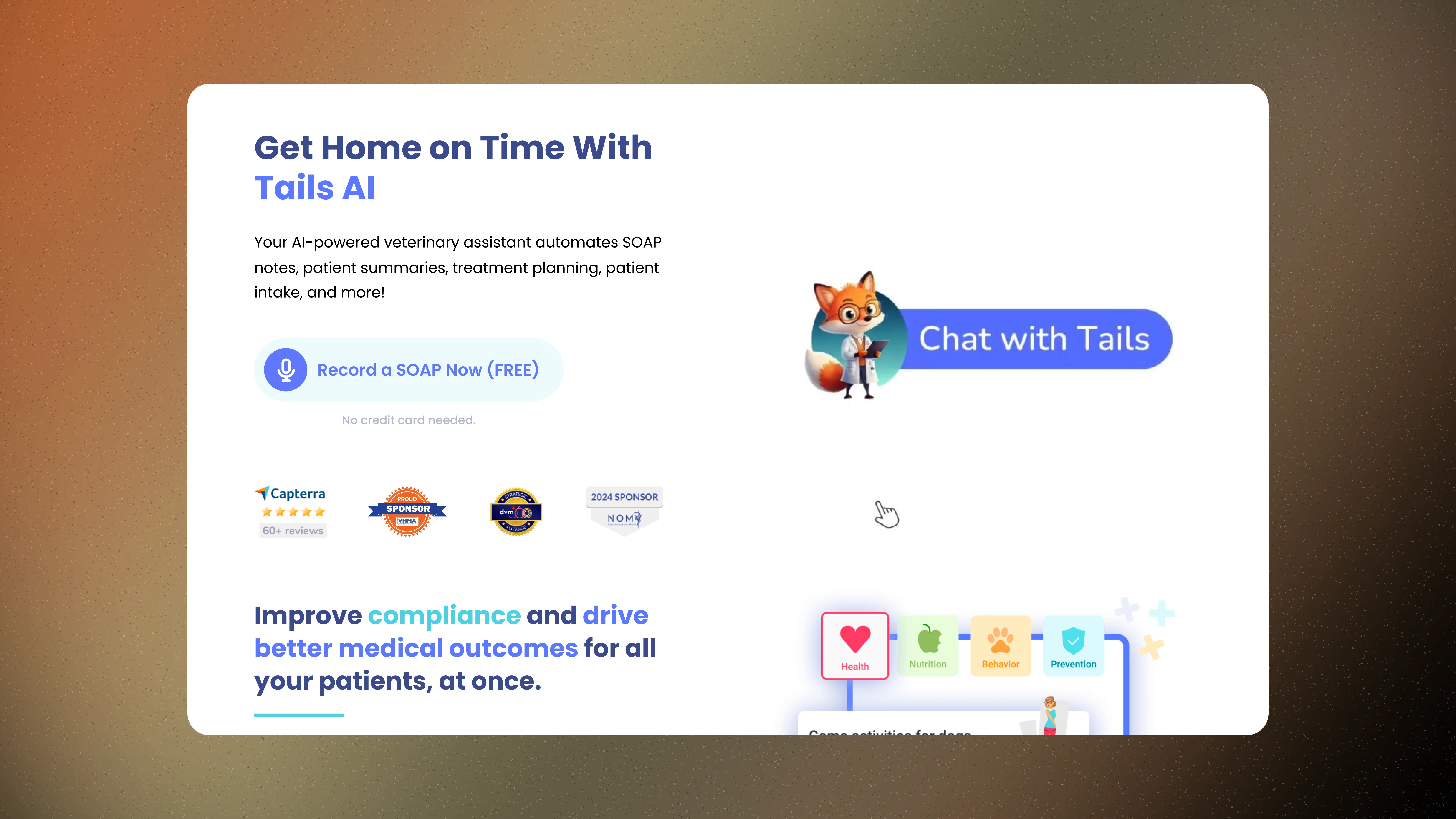
We swapped vague claims for verifiable proof, real DVMs, real numbers, real outcomes, to make the page's trust harder to doubt.
We swapped vague claims for verifiable proof, real DVMs, real numbers, real outcomes, to make the page's trust harder to doubt.
New design backs up statements with real-world impact.
The old page made promises. The new one makes its case.
Before, the copy leaned on vague value props — "nurture relationships," "increase compliance," "your super power." No names. No numbers. No proof a reader could check.
We rebuilt it around evidence.
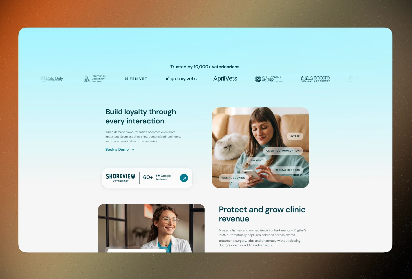
Real customers, real names: Swapped abstract benefit statements for testimonials from actual DVMs, complete with photo, name, clinic, and a specific win attached to each.
Numbers instead of adjectives: "35 patients per DVM per day." "10 minutes saved per visit." Specificity does the convincing, not adverbs. Placed exactly where a visitor needed to see it.
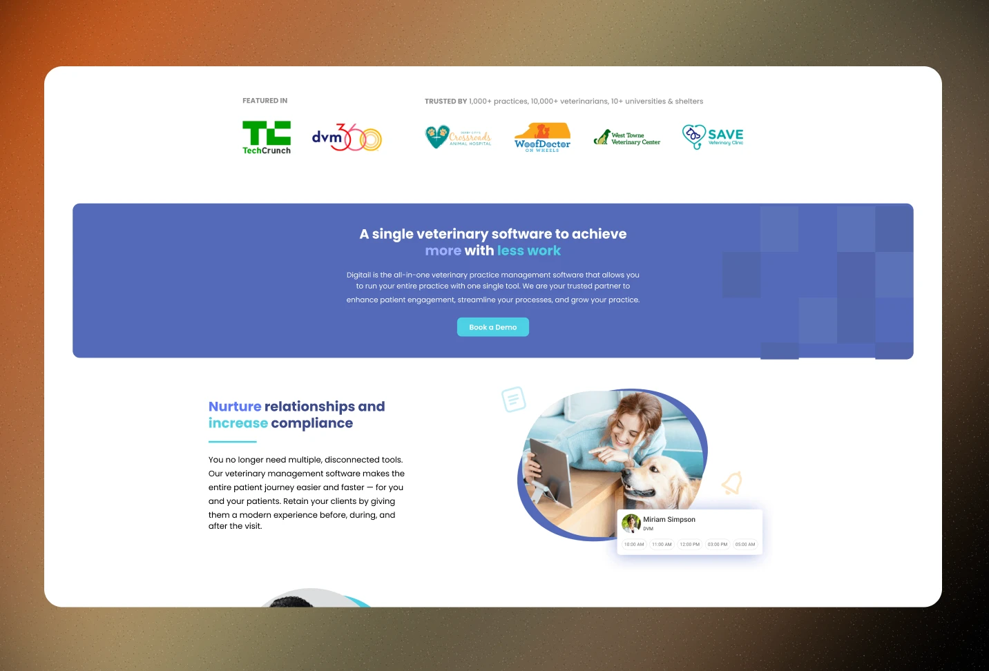
Scale as social proof: Added "Trusted by over 10,000 veterinarians," a single line that reframes every claim below it.
Always providing a clear next step: One CTA, "Book a Demo," instead of asking the reader to figure out what to do with the trust we just built.
The result: a 20% lift in conversion since the trust-first model went live. Four outcomes identified, each one aligned to a piece of concrete proof across the page — not just headline claims, sitewide.
The old page made promises. The new one makes its case.
Before, the copy leaned on vague value props — "nurture relationships," "increase compliance," "your super power." No names. No numbers. No proof a reader could check.
We rebuilt it around evidence.
Real customers, real names: Swapped abstract benefit statements for testimonials from actual DVMs, complete with photo, name, clinic, and a specific win attached to each.
Numbers instead of adjectives: "35 patients per DVM per day." "10 minutes saved per visit." Specificity does the convincing, not adverbs. Placed exactly where a visitor needed to see it.
Scale as social proof: Added "Trusted by over 10,000 veterinarians," a single line that reframes every claim below it.
Always providing a clear next step: One CTA, "Book a Demo," instead of asking the reader to figure out what to do with the trust we just built.
The result: a 20% lift in conversion since the trust-first model went live. Four outcomes identified, each one aligned to a piece of concrete proof across the page — not just headline claims, sitewide.


Notes
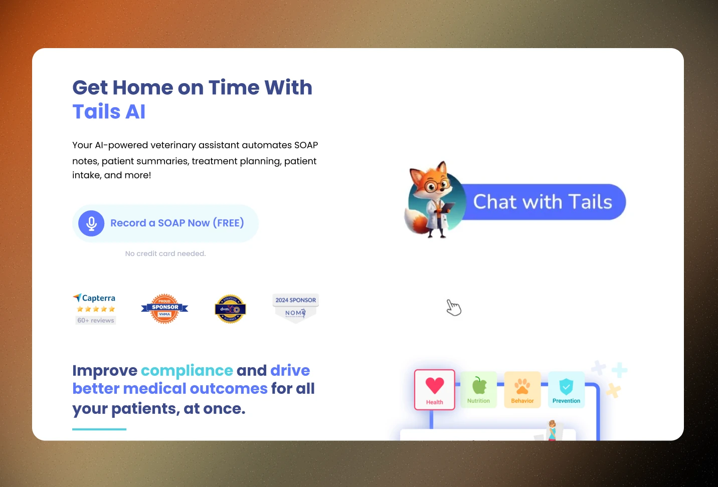
We went from zero credibility markers to trust signals woven through every stage of the journey, logos, numbers, and named clients replacing empty claims.
We went from zero credibility markers to trust signals woven through every stage of the journey, logos, numbers, and named clients replacing empty claims.

Notes
We turned a flat feature list into a navigation that argues the case, simpler on the surface, more guided underneath.
We turned a flat feature list into a navigation that argues the case, simpler on the surface, more guided underneath.
Designed for the way prospects think.
The old nav told you what existed. It never told you why the product mattered.
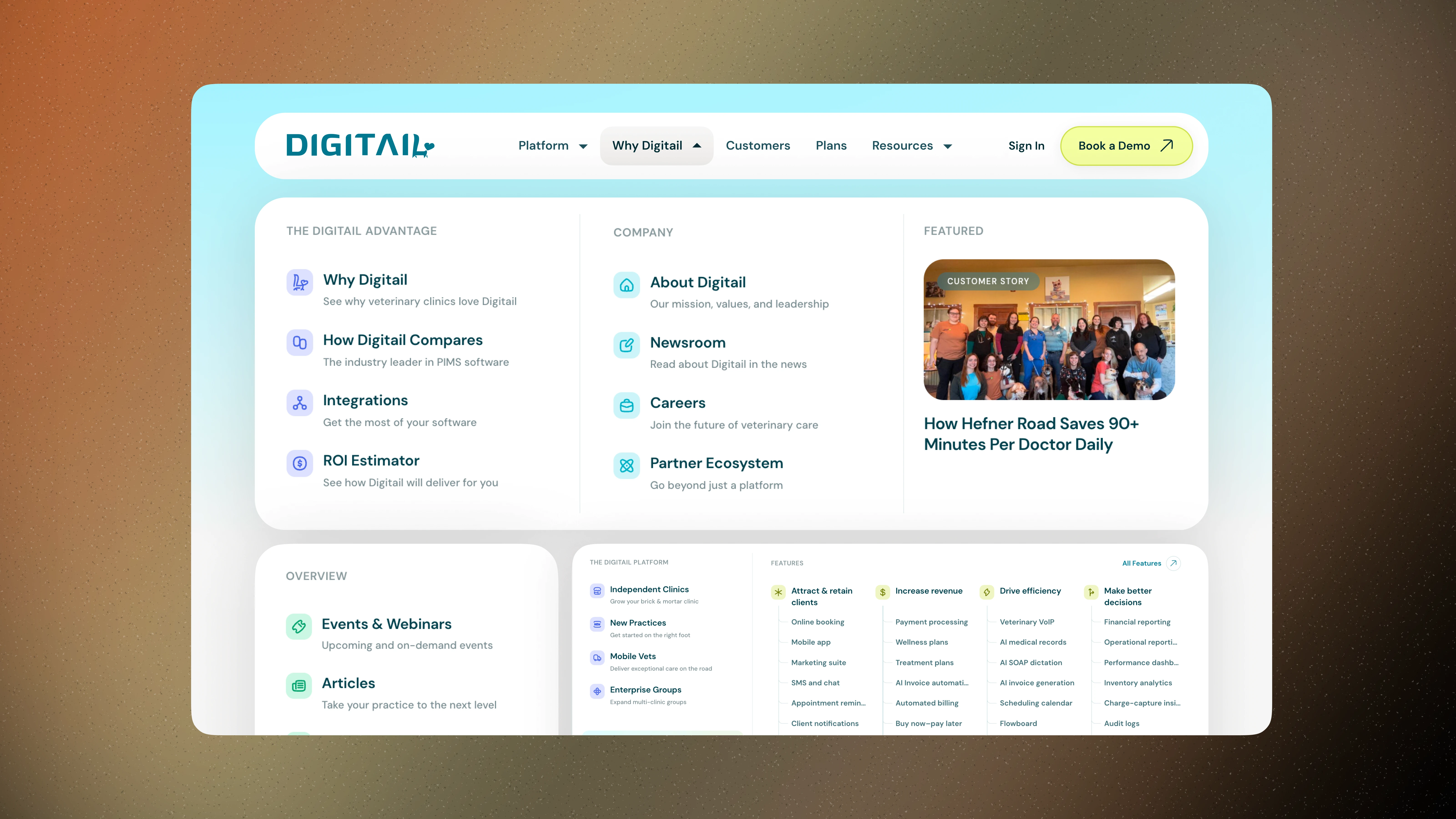
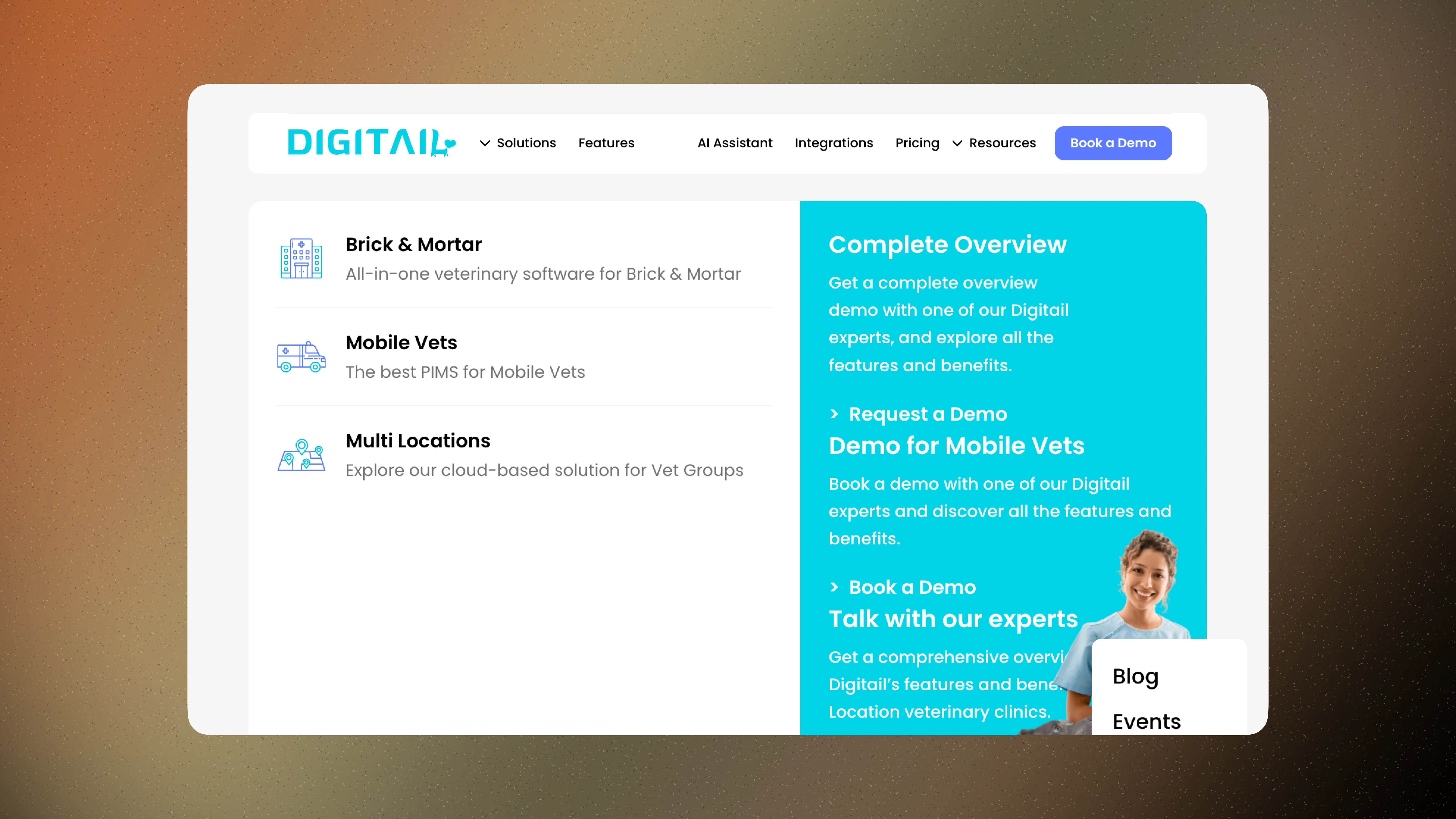
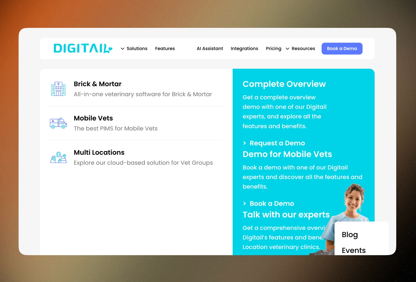
Before, the menu was a flat list of segments and features, Brick & Mortar, Mobile Vets, Multi Locations, technically accurate, but it spoke the business's language, not the prospect's. No case being made, nothing guiding a skeptical visitor toward a decision.
We rebuilt it to do the convincing, not just the listing.
Guides the user through skepticism, making a strong case for the business instead of just naming its parts.
Simplified groupings that read at a glance instead of demanding a scan.
Gives a full view of the business immediately, platform, customers, plans, resources, all legible in one pass.
We removed parent-level pages from the top-level menu for a simpler first impression, then rebuilt the depth inside a guided mega menu, so nothing got lost, it just got easier to find.
Notes
We matured the visual design for enterprise buyers without losing what made the brand feel human, sharper layout, stronger proof, same warmth.
We matured the visual design for enterprise buyers without losing what made the brand feel human, sharper layout, stronger proof, same warmth.
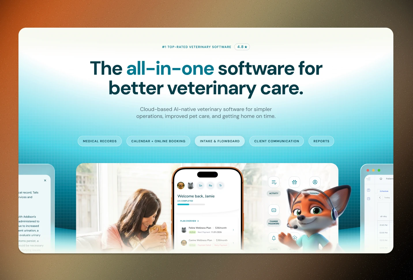
Sleek enterprise design meets brand warmth.
The old design was too cute to be taken seriously.
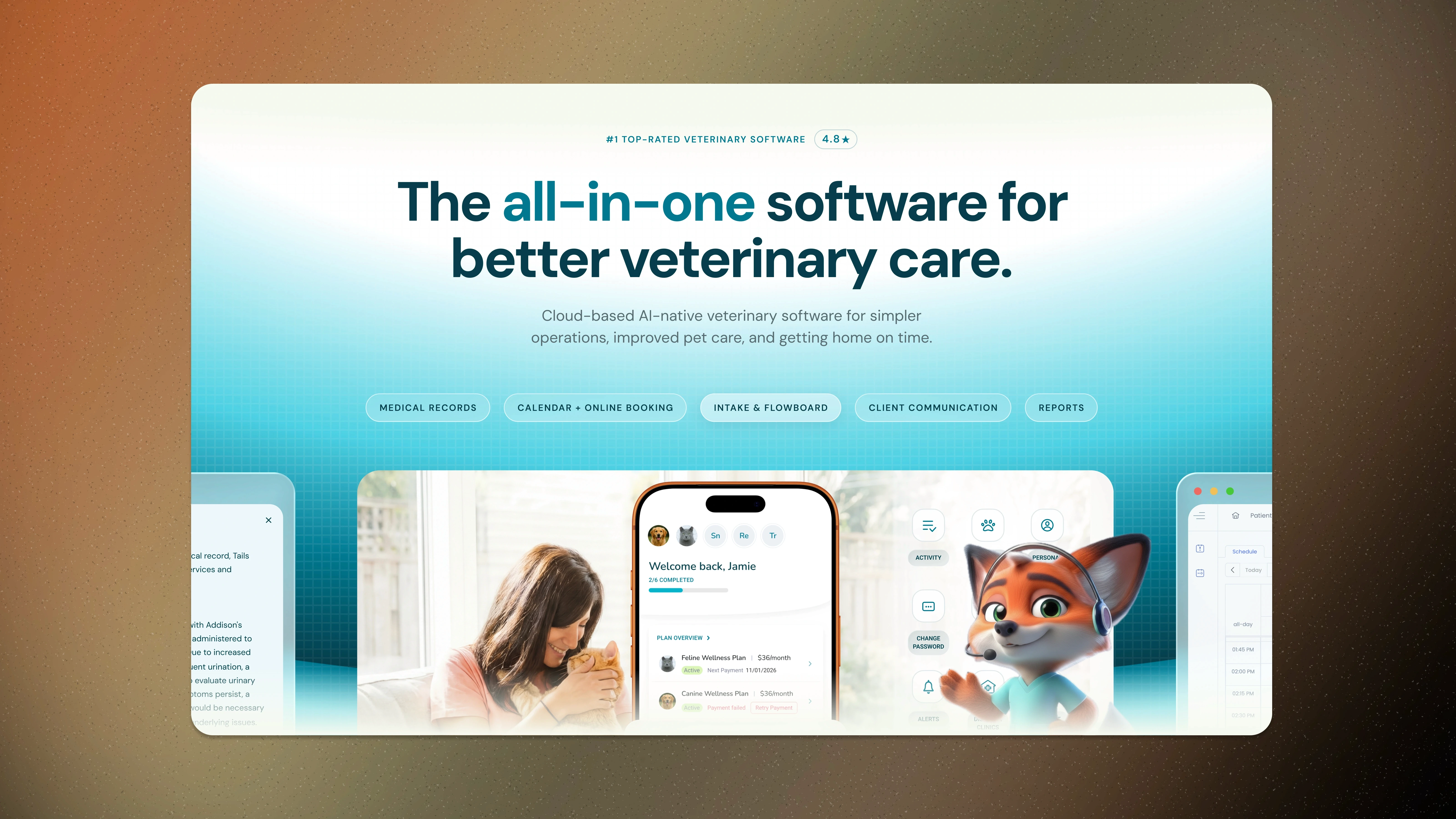
Before, the aesthetic leaned young and playful, charming, but it worked against the business. Enterprise buyers scanning for a viable vendor looked at it and moved on. Cuteness read as inexperience.
We kept the warmth. We fixed the credibility.
Easier navigation to the platform's most popular features, no more digging.
Revamped the brand mascot itself, the fox went from decorative to designed.
Added an enterprise call-out and social proof right at the top, "#1 Top-Rated Veterinary Software," 4.8 stars, before the scroll even starts.
The platform transitioned to a sleek, modern, enterprise-ready look, clean sections, confident hierarchy, while keeping the brand's personality intact. Serious enough to trust. Warm enough to still feel like Digitail.
The old design was too cute to be taken seriously.
Before, the aesthetic leaned young and playful, charming, but it worked against the business. Enterprise buyers scanning for a viable vendor looked at it and moved on. Cuteness read as inexperience.
We kept the warmth. We fixed the credibility.
Easier navigation to the platform's most popular features, no more digging.
Revamped the brand mascot itself, the fox went from decorative to designed.
Added an enterprise call-out and social proof right at the top, "#1 Top-Rated Veterinary Software," 4.8 stars, before the scroll even starts.
The platform transitioned to a sleek, modern, enterprise-ready look, clean sections, confident hierarchy, while keeping the brand's personality intact. Serious enough to trust. Warm enough to still feel like Digitail.
Notes
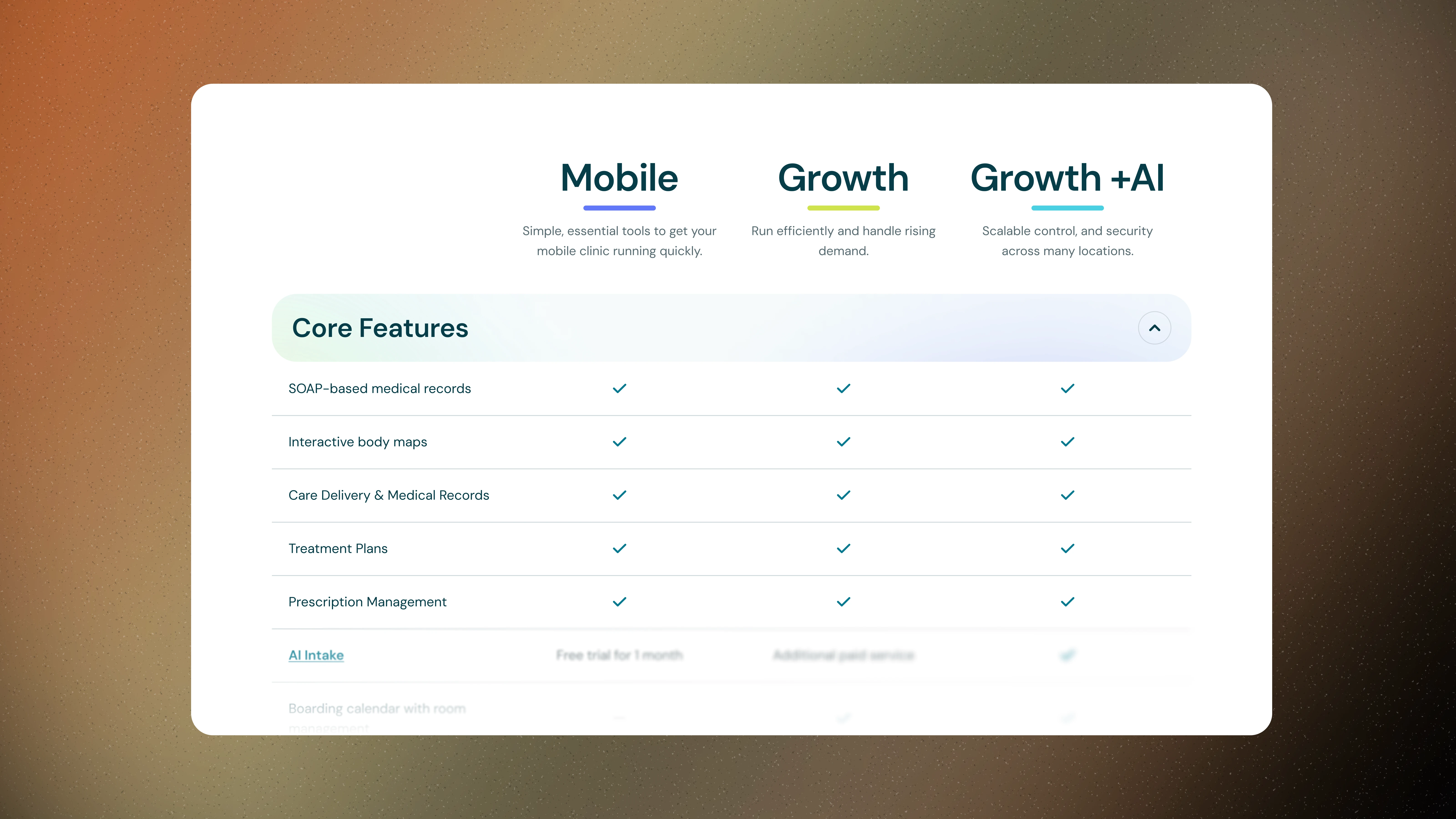
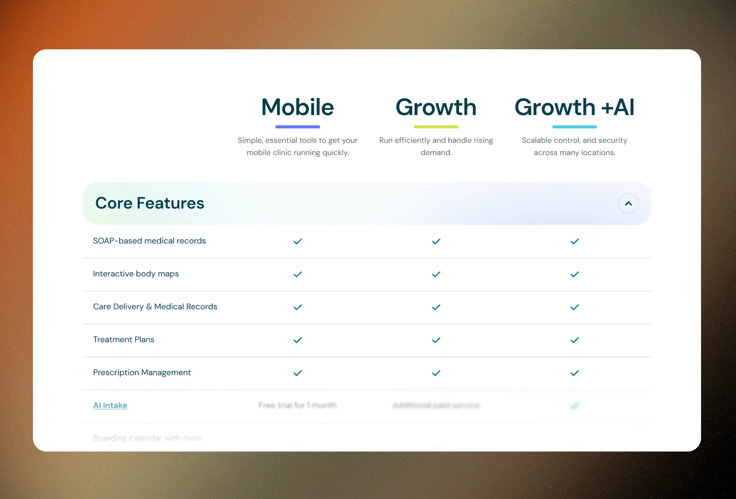
We replaced a flat feature list with tiered, segmented pricing, structured for how buyers actually decide, with enterprise finally getting its own path.
We replaced a flat feature list with tiered, segmented pricing, structured for how buyers actually decide, with enterprise finally getting its own path.
Simple, clear, and ready for enterprise.
The old pricing page listed features. It never answered "which one is for me?"
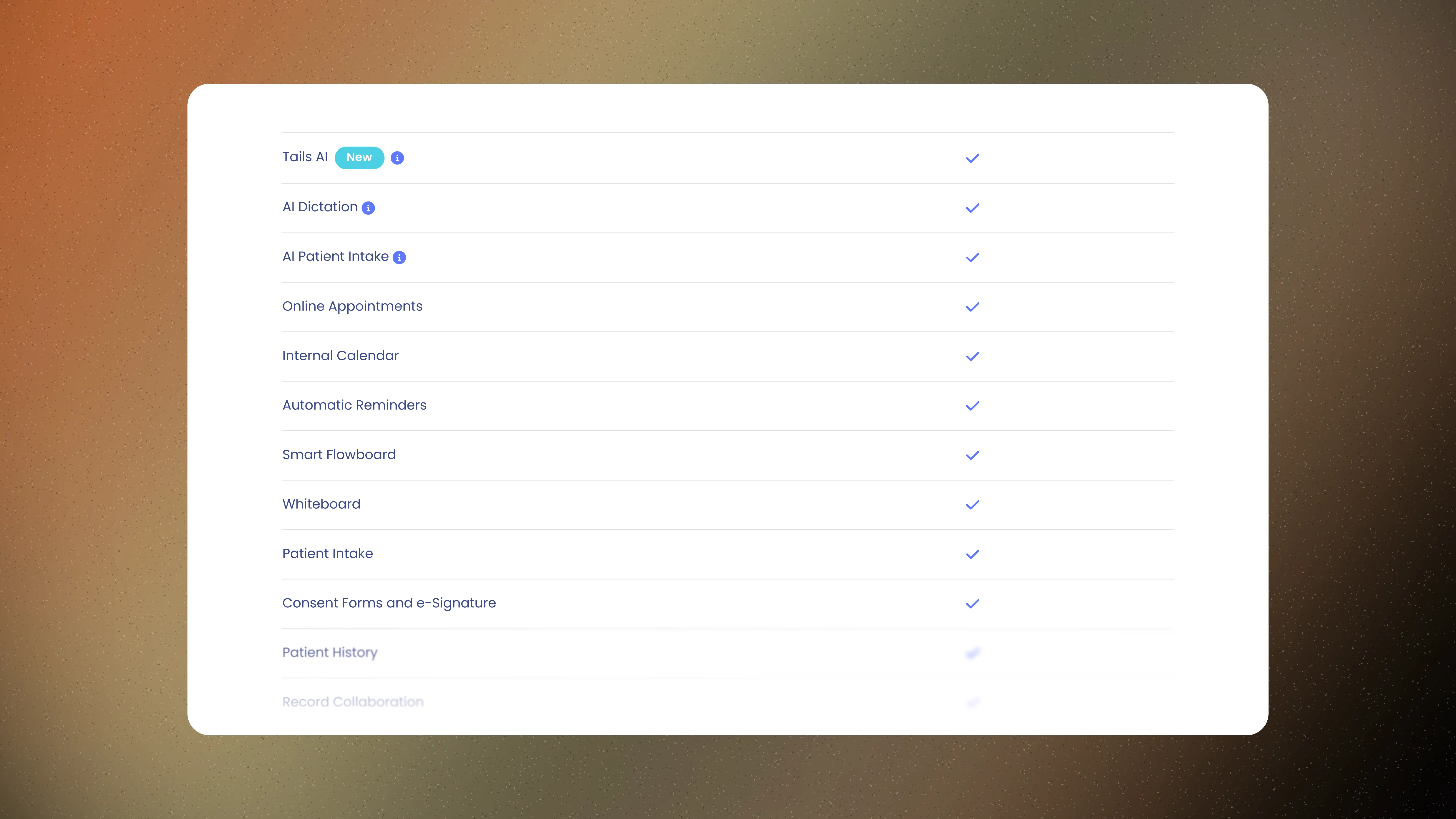
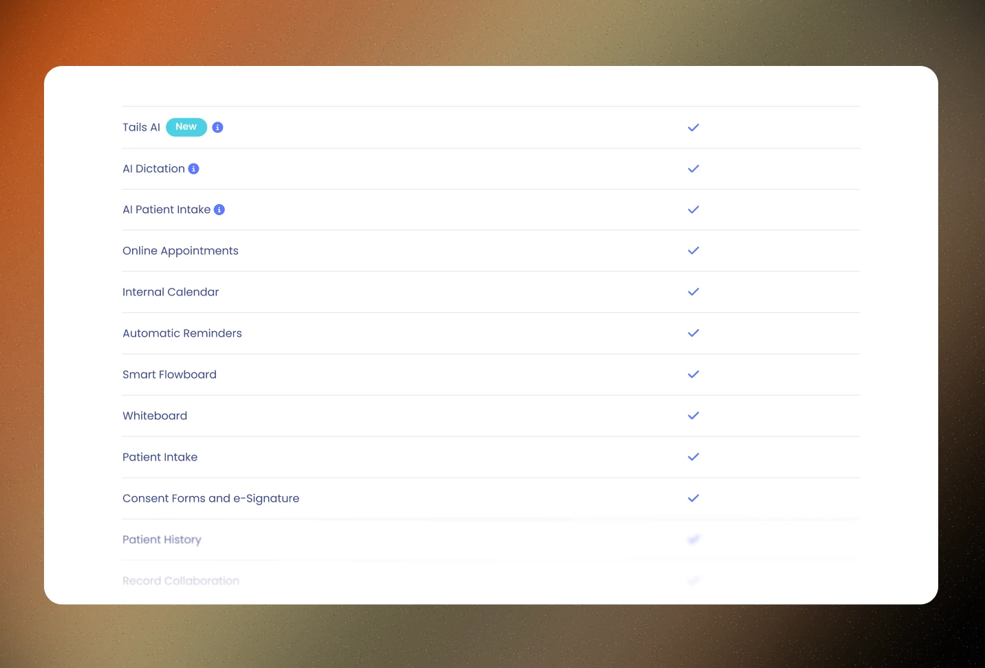
Before, it was one long checklist, every feature, one column, checkmarks straight down the page. No tiers, no segmentation, and nothing built for the high-value enterprise buyer trying to figure out where they fit.
We turned a list into a decision.
Three pricing tiers built around customer group, Mobile, Growth, Growth +AI, plus a clear upsell path between them.
Features organized by category, Core Features, Client Management & Communication, Reporting, so a buyer scans by what they need, not by scrolling everything.
Added an enterprise call-out with social proof, a dedicated tier with its own "Talk to Sales" path, no more forcing enterprise buyers through a self-serve checklist built for someone else.
This came out of real cross-team work. Sales and Design sat down together and built a structure that reflects how services actually get used across different contexts, not just how they're built internally.
The old pricing page listed features. It never answered "which one is for me?"
Before, it was one long checklist, every feature, one column, checkmarks straight down the page. No tiers, no segmentation, and nothing built for the high-value enterprise buyer trying to figure out where they fit.
We turned a list into a decision.
Three pricing tiers built around customer group, Mobile, Growth, Growth +AI, plus a clear upsell path between them.
Features organized by category, Core Features, Client Management & Communication, Reporting, so a buyer scans by what they need, not by scrolling everything.
Added an enterprise call-out with social proof, a dedicated tier with its own "Talk to Sales" path, no more forcing enterprise buyers through a self-serve checklist built for someone else.
This came out of real cross-team work. Sales and Design sat down together and built a structure that reflects how services actually get used across different contexts, not just how they're built internally.
Good design creates real outcomes for our clients.
Good design creates real outcomes for our clients.
Good design creates
real outcomes for our clients.
Oba studio partners with businesses looking to succeed by creating human-centered websites that customers trust, score well on SEO, and generate more leads.
Oba studio partners with businesses looking to succeed by creating human-centered websites that customers trust, score well on SEO, and generate more leads.

Will Remigio
Will Remigio
Founder & Lead Designer, Oba Studio
Founder & Lead Designer, Oba Studio
Book a Discovery Call
See if Oba Unlimited is the right fit for you
(it totally is)
See if Oba Unlimited is the right fit for you
(it totally is)
Schedule a quick, 15 minute guided tour
through Oba Unlimited
Schedule a quick, 15 minute guided tour through Oba Unlimited

Oba subscription slots are limited. For faster service, email hello@oba.design for a same-day response.
Headquartered in Minneapolis, Minnesota