AVIX - Case Study

AVIX - Case Study

AVIX - Case Study

2X

Conversion doubled

19.6%

Customer satisfaction

1.1%

Customer churn rate

2X

Conversion doubled

19.6%

Customer satisfaction

1.1%

Customer churn rate

See the case study

The Challenge

The Solution

AVIX, formerly Visualize Me AI, had impressive technology but an experience users found hard to understand. Scan satisfaction was low, and churn hit 77.8%.

The Challenge

The Solution

AVIX, formerly Visualize Me AI, had impressive technology but an experience users found hard to understand. Scan satisfaction was low, and churn hit 77.8%.

Outcome

2X

Conversion, doubled.

Purchase conversion climbed to an all time high at 7%

19.6%

Higher customer Satisfaction

Boost in scan satisfaction.

1.1%

Churn is at an all time low

Only 1% of customers cancelled subscriptions after six months.

"Subscription reached an all-time high. Scan satisfaction reached 83%, setting an all-time high. AVIX launch was a success."

"Subscription reached an all-time high. Scan satisfaction reached 83%, setting an all-time high. AVIX launch was a success."

Jin Koh

Investor & Founder of AVIX

"Subscription reached an all-time high. Scan satisfaction reached 83%, setting an all-time high. AVIX launch was a success."

Jin Koh

Investor & Founder of AVIX

About The Project

Rebuilding trust in an AI body scan, from first scan to paid subscriber.

AVIX is an AI body-scan fitness app. The premise is simple. Stand in front of a camera, get a read on your body composition, track it over time. The execution is where most apps in this category fall apart. Users get confused mid-scan and drop off. Or they finish the scan... and the results feel arbitrary. So they either trust it blindly, or quietly stop opening the app. Here's the pattern we saw: trust, not technology, was the real product problem.

Intuitive Exploration

So this redesign was never about making the app prettier. It was about building credibility.

The goal was to make the experience effortless. Making every number defensible, from the first scan to the hundredth, from free user to paid subscriber. That principle is the foundation for everything that follows. Four areas where the interface had to earn trust, and get people excited about transforming their body, not just show them data. Each one maps to a real number. The actual funnel. The actual satisfaction score. The actual growth curve.

The goal was to make the experience effortless. Making every number defensible, from the first scan to the hundredth, from free user to paid subscriber. That principle is the foundation for everything that follows. Four areas where the interface had to earn trust, and get people excited about transforming their body, not just show them data. Each one maps to a real number. The actual funnel. The actual satisfaction score. The actual growth curve.

The goal was to make the experience effortless. Making every number defensible, from the first scan to the hundredth, from free user to paid subscriber. That principle is the foundation for everything that follows. Four areas where the interface had to earn trust, and get people excited about transforming their body, not just show them data. Each one maps to a real number. The actual funnel. The actual satisfaction score. The actual growth curve.

Paywall

More subscribers, with an all-time low churn rate
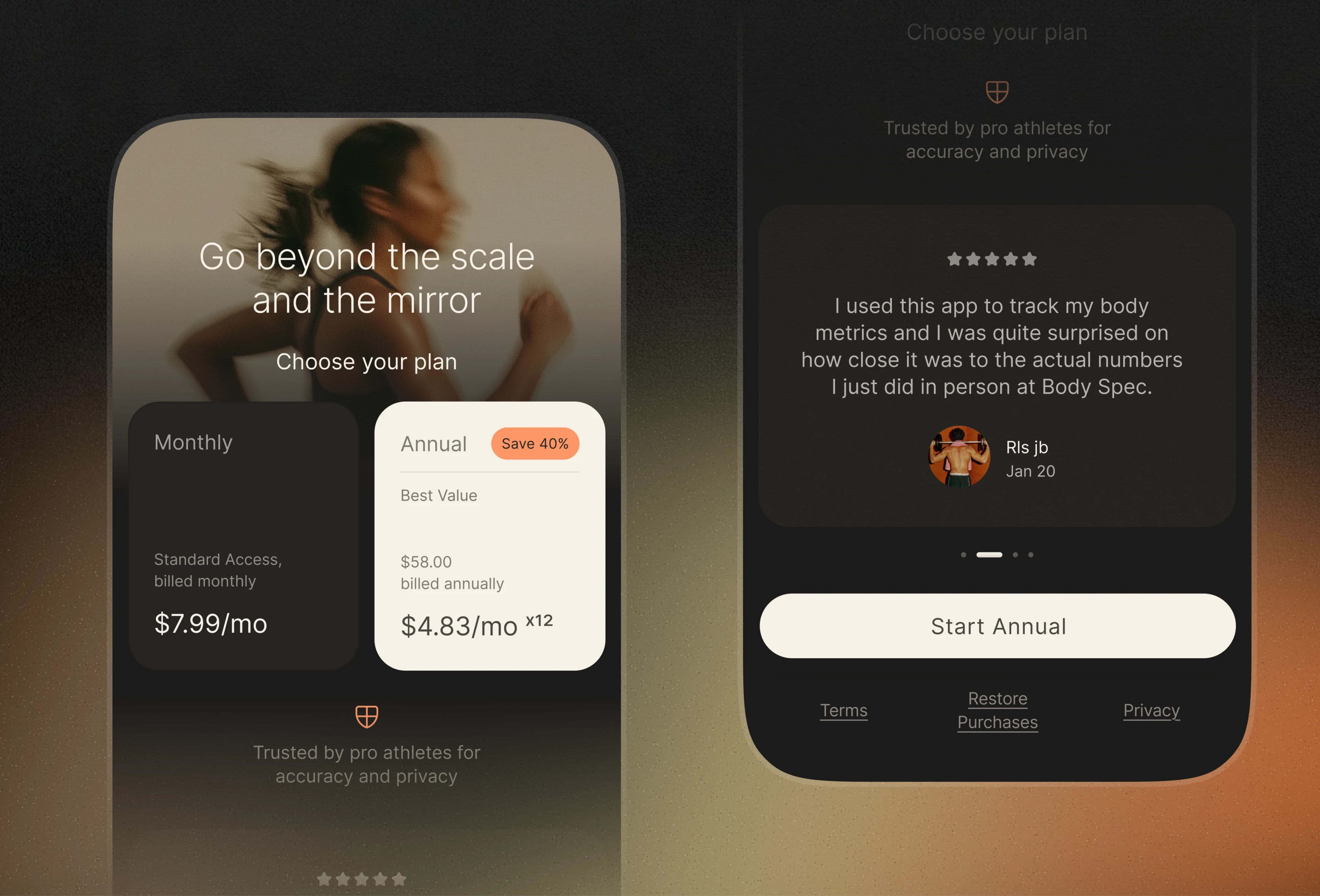
Users weren't converting. And churn kept climbing... 77.8% at its peak that year. So we stopped guessing and started testing. Three experiments. One flow: the first-time onboarding, and two different paywall placements. Each one tested a different hypothesis about when and how to ask for money.

Users weren't converting. And churn kept climbing... 77.8% at its peak that year. So we stopped guessing and started testing. Three experiments. One flow: the first-time onboarding, and two different paywall placements. Each one tested a different hypothesis about when and how to ask for money.

Paywall

Paywall anatomy best practices: Hero, plan, sticky floating button (always showing CTA), privacy & trust, social proof.
Here's the pattern we found.

  • Value-first alone wasn't enough. Removing the paywall made people happier with the scan, but conversion barely moved. 

  • What worked was the preview. Show enough of the results to prove the value... then ask, with a dismissable paywall right at the moment curiosity peaks. We also rebuilt the pricing logic. 

  • We replaced the 7-day trial with 2 free scans, since scans need two weeks between them and a trial never matched how the tech works.

  •  We also doubled the monthly price to push annual plans, where churn was lowest.

The result? 2X conversion in one month. Churn down to 1.1%.

Onboarding

A more intuitive onboarding

Users kept telling us the same thing: the scan process was hard to understand. That confusion cost us twice. People dropped off before finishing. And the ones who did finish often captured poor-quality images... which meant less accurate body composition results. A bad scan doesn't just hurt the experience. It breaks trust in the data.

Onboarding

The old onboarding had 25 screens; we got it down to 19, helping users get to value 24% faster. We noticed a 19.6% raise in scan satisfaction since the update.

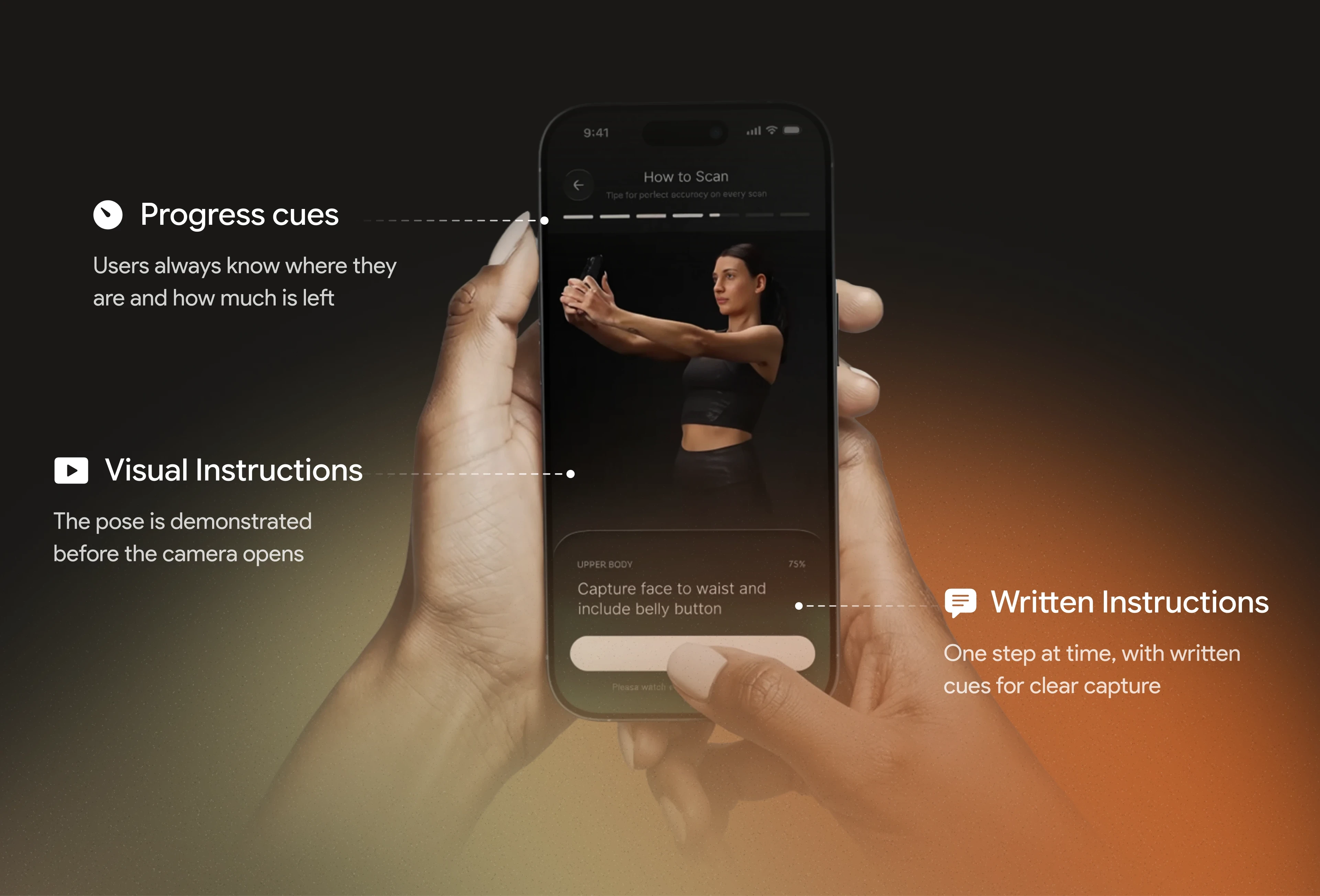
Still sounds like a lot, right? But capturing accurate 3D body geometry takes real prep: a checklist, positioning, and 3 image captures. So we cut everything else. We merged 3 intro screens into the sign-in screen, using a carousel to show the product benefits. Users got to their first scan much faster. Then we rebuilt the scan tutorial with short videos showing exactly what to do at each step, including how to hold the phone. Every non-essential screen, gone.

Privacy & Trust

Get to the “aha moment”

AVIX users come in all shapes and sizes. Some are extremely athletic. Others are just starting their transformation journey. But there was a deeper problem... Many users don't like their bodies yet. Showing them a photorealistic 3D render of themselves could shock someone. This needed a sensitive approach, not just a secure one.

Privacy & Trust

The “aha moment” is seeing real body transformation and evolution. But a thoughtful way to reveal this was needed.

So we started with one question: what is the “aha moment” for our users? Here's what we found. It's watching your body change over time, in real 3D geometry. We tackled the body-image shock by creating two ways to see your body. "Stardust," a point-cloud aesthetic (example above), and photo realism. The result? Scan satisfaction rose from 65% to 85% within one month of launch.

Results Experience

Surfacing insights that matter.

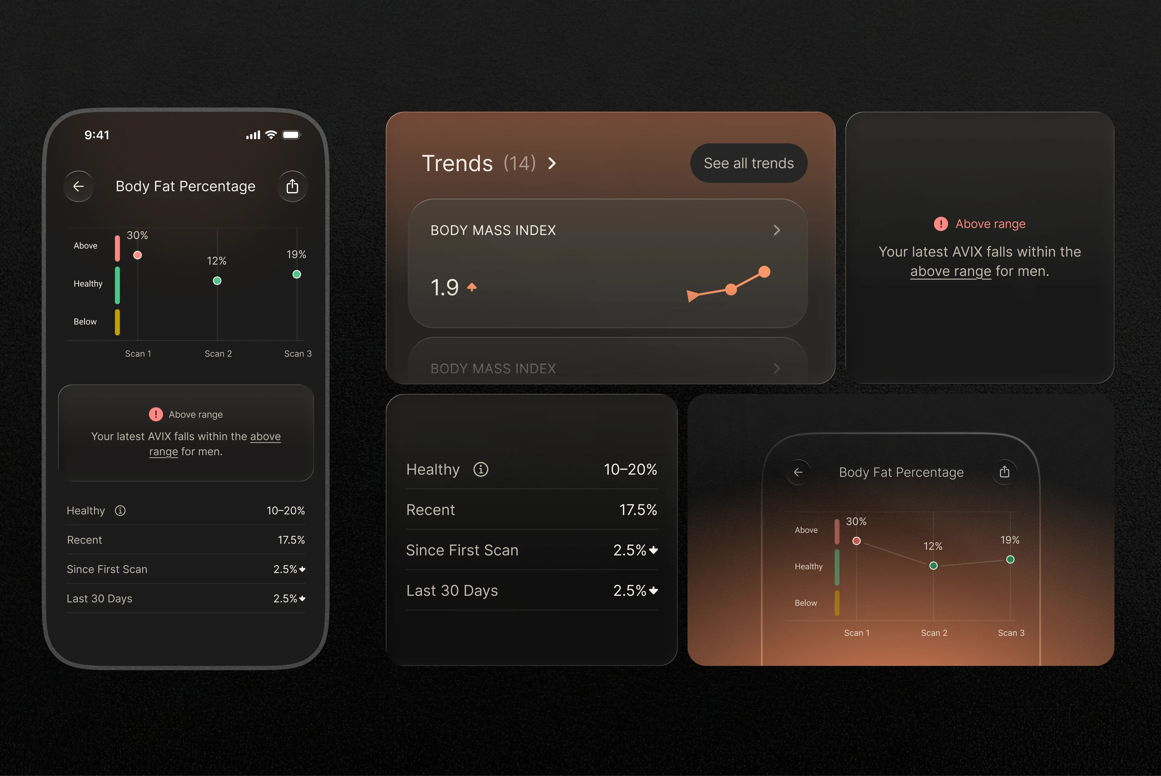
Before Oba, users saw their results and body 3D geometry, one at a time… But they had no idea what those numbers meant. A body fat percentage without context is just a number. No reference point. No story.
Results Experience

Am I in a healthy range for my age, gender, height, and weight? Now every scan answers that question.

Now we show a trend line moving up/down, in healthy/unhealthy ranges across the metrics they actually care about. So we built the trend line. Results stopped being data and started being progress.

Now we show a trend line moving up/down, in healthy/unhealthy ranges across the metrics they actually care about. So we built the trend line. Results stopped being data and started being progress.

Good design creates real outcomes for our clients.

Good design creates real outcomes for our clients.

Good design creates
real outcomes for our clients.

Will Remigio

Will Remigio

Will Remigio

Founder & Lead Designer, Oba Studio

Founder & Lead Designer, Oba Studio

Founder & Lead Designer, Oba Studio

Book a Discovery Call

See if Oba is the right fit for you

See if Oba is the right fit for you

(it totally is)

(it totally is)

Schedule a quick, 15 minute guided tour

through Oba Unlimited

Schedule a quick, 15 minute guided tour through Oba Unlimited

Schedule a quick, 15 minute guided tour through Oba Unlimited

Oba subscription slots are limited. For faster service, email hello@oba.design for a same-day response.

Oba subscription slots are limited. For faster service, email hello@oba.design for a same-day response.

Headquartered in Minneapolis, Minnesota